Customize Branding
Overview
Sensibill SDKs themes are based on the Material design system . The same theme configuration can be used to both the native and web SDKs.
Default palette
| Property | Default | Color |
|---|---|---|
| primary | #186DB3 | |
| primaryVariant | #21384D | |
| onPrimary | #EEEEEE | |
| secondary | #F8897F | |
| onSecondary | #010101 | |
| background | #FBFBFB | |
| onBackground | #4F5056 | |
| surface | #FFFFFF | |
| onSurface | #000000 | |
| surfaceVariant | #E2F9FF | |
| onSurfaceFocus | #0990D5 | |
| error | #FF0000 | |
| onError | #FFFFFF |
What can be customized?
Colors
Colors can be any color supported by CSS, as a name or hex code. Colors are mapped as in the above chart. See platform specific implementations for more details.
Spend Manager SDK (iOS/Android/Web)
Integrator customization
Content that relates to the capture process (taking pictures) can be customized by the integrator. Including:
- Colors
- Text/Strings
- Icons (Android/iOS capture only)
- Icon colors (Receipt Management UI) see Icon Palette mapping .
Integrators can also modify the default theme (see palette above) through the integration of our SDK(s).
Sensibill customization
Modifications to receipt management UI are performed by Sensibill, during your onboarding we will work with you to update localized content and iconography. We will then host these assets on your behalf where they can be modified by contacting our support team.
- Text/Strings
- Custom icon shapes (colors are adaptive based on the palette)
Note: Customization of theme is supported through the entry points into the SDK(s).
Overview
The SDKConfiguration class, and the types it contains, encapsulate the configuration and branding aspects of the SDK. The singleton instance SDKConfiguration.shared provides an access to all current configuration and branding values, and allows to change any of the values.
The ColorPalette class, accessible via the SDKConfiguration.shared.colors property, provides the way to map your branding to all the visual elements of the SDK components.
In addition, using the CaptureStyle class, accessible via the SDKConfiguration.shared.capture.theme property, you can tweak the colors and appearance of each element of the Capture experience.
Changing the color palette
When SDKConfiguration.shared is created, its colors property is initialized with the colors from the default palette, described above. You can override this default palette with your colors before starting the SDK:
let configuration = SDKConfiguration.shared

configuration.colors.primary = .blue
configuration.colors.primaryVariant = .purple
configuration.colors.onPrimary = .white

configuration.colors.secondary = .magenta
configuration.colors.onSecondary = .white

configuration.colors.background = .white
configuration.colors.onBackground = .black

configuration.colors.surface = .cyan
configuration.colors.surfaceVariant = .orange
configuration.colors.onSurface = .black
configuration.colors.onSurfaceFocus = .green

configuration.colors.error = .red
configuration.colors.onError = .white
Since you are setting these properties on the singleton SDKConfiguration.shared object, there are no other changes needed (i.e. you don’t need to pass this object anywhere) as any UI created in the SDK will use these new values.
Fine-grained branding of the Capture experience inside the SDK
By default Capture is using a minimalistic, mostly black and white theme, with the few touches from the color pallete we discussed above. This matches with the colors of the theme in camera apps most users are familiar with. You can, however, override the styling of every element of the capture experience. See CaptureTheme in the Capture reference documentation for a complete list of properties you can override, and their default values. When integrating with SDK, override desired properties of the CaptureTheme using CaptureStyle class. Only provide the overrides for properties you want to override, all other properties will be filled automatically, using capture colors, and your brand palette. In the following example, we are changing the color of the area identified as a receipt by auto-capture, and a color of the Done button on Crop screen, using the colors from main theme:
let configuration = SDKConfiguration.shared
configuration.capture.theme.detectionStrokeColor = configuration.colors.primary
configuration.capture.theme.cropDoneButtonBackgroundColor = configuration.colors.secondary
Branding on standalone Capture
When integrating with standalone capture, the following steps should be performed to customize the theme:
- Create an instance of
DefaultThemeobject. You can optionally provide a bundle with assets and colors to be used with the Capture. If no bundle is provided, the default assets and colors will be used. - Optionally you can tweak properties of the
DefaultThemeobject you created. - Next, create an instance of
CaptureThemeobject, providing a createdDefaultThemeinstance as an argument. - Optionally you can tweak the properties of the
CaptureTheme. - Build
CaptureConfigurationobject, usingCaptureConfigurationBuilder, and include aCaptureThemeinstance, created in step 3. - Create an instance of
CaptureNavigationControllerand provide an instance ofCaptureConfigurationobject you created in previous step. - Follow the normal presentation process for the standalone Capture.
Example:
// Step 1: Create an instance of DefaultTheme.
let defaultTheme = DefaultTheme(overrideBundle: nil) // can also provide a bundle

// Step 2 (optional): Customize default theme properties
//...

// Step 3: Create an instance of CaptureTheme
let captureTheme = CaptureTheme(defaults: defaultTheme)

// Step 4 (optional): Customize additional properties here
//...

// Step 5: Build CaptureConfiguration object
let captureConfiguration = CaptureConfigurationBuilder()
                .add(theme: captureTheme)
                .build()

// Step 6: Create CaptureNavigationController with previously created configuration
let capture = CaptureNavigationController(configuration: captureConfiguration)

// Step 7: proceed with normal capture presentation process.
capture.modalPresentationStyle = .fullScreen
capture.captureDelegate = self
present(capture, animated: true, completion: nil)
Font Customization
To customize the fonts used for Capture, and Error views, specify the desired fonts in the
SDKConfiguration.shared.fontsproperty. You can customizeregularFontandboldFont.To customize the Web fonts used in Sensibill UI, override the fonts in
configuration.sensibillUI.webFontsproperty. Currently only changingregularfont is supported. Other fonts will be updated by Sensibill UI automatically, based on regular font. See theSensibillUIFontfor more information on font properties.
Example:
let configuration = SDKConfiguration.shared

// Changing fonts for Capture and error screens
configuration.fonts = SDKConfiguration.FontSet(
    regularFont: .systemFont(ofSize: 14),
    boldFont: .systemFont(ofSize: 16, weight: .bold)
)

// Changing Web font for sensibill UI
configuration.sensibillUI.webFonts.regular = SDKConfiguration.SensibillUIFont(
    family: "Lobster, Times, serif",
    url: "https://fonts.googleapis.com/css2?family=Lobster&display=swap"
)
Asset Customization
To customize assets in the Sensibill SDK, an external Bundle must be added to the SDK first. The SDK will use this added bundle to check for assets to use in the Sensibill UI. The assets inside of the Bundle must have the same name as assets already used in the SDK. By doing so, the provided assets override what is in the SDK.
- Follow Using External Bundle instructions to create an external bundle, and to provide its name to the SDK using SDKConfiguration .
- Inside the Bundle created in Step 1, create an Asset Catalog called SensibillAssets.xcassets
Image Customization
Once you have provided an external bundle that the Sensibill SDK will use to retrieve assets, and created an Asset Catalog, images in the SDK can be overridden.
- Follow the steps in Asset Customization first
- Prepare the desired imageset and rename it to match the imageset you want to replaced. For example, you can name an imageset to
capture-closeto override the close icon in the Receipt capture screen - Copy the imageset from step 1 into the Asset Catalog SensibillAssets.xcassets from the Asset Customization steps above.
Example Bundle Structure:
 Full size
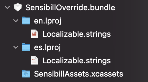
Customize The Android SDK Theme
To style the SDK with your brand colors, override the Sensibill external theme Theme.Sensibill. See the design palette above for default colors.
Note: For the theme override to work correctly, you must name your style “Theme.Sensibill” and it must have the parent “Base.Theme.Sensibill”
<style name="Theme.Sensibill" parent="Base.Theme.Sensibill">
    <item name="sb__colourPrimary">@color/sb__primary</item>
    <item name="sb__colourPrimaryVariant">@color/sb__primary_variant</item>
    <item name="sb__colourOnPrimary">@color/sb__on_primary</item>

    <item name="sb__colourSecondary">@color/sb__secondary</item>
    <item name="sb__colourOnSecondary">@color/sb__on_secondary</item>

    <item name="sb__colourBackground">@color/sb__background</item>
    <item name="sb__colourOnBackground">@color/sb__on_background</item>

    <item name="sb__colourSurface">@color/sb__surface</item>
    <item name="sb__colourSurfaceVariant">@color/sb__surface_variant</item>
    <item name="sb__colourOnSurface">@color/sb__on_surface</item>
    <item name="sb__colourOnSurfaceFocus">@color/sb__on_surface_focus</item>

    <item name="sb__colourError">@color/sb__error</item>
    <item name="sb__colourOnError">@color/sb__on_error</item>
</style>
Advanced Customization
Apply Styles to Specific Components
In scenarios where further customization is needed, the style properties for individual views can be overridden as well. For more information on this type of customization please reach out to us.
Runtime Theming
The Sensibill Android SDK has the ability to accept a programmatic theme at runtime if required. Please see this page for more details.
You can inject your brand’s font and colors when you initialize the Sensibill instance.
To configure all of the branding properties, include a brand block when creating the SensibillSDK:
const instance = await SensibillSDK.create(

    // Provide a reference to the element you want to contain the iframe
    document.getElementById('your-element'),

    // Provide an initialization object which contains your client id
    { clientID: 'your-client-id'},

    // Provide a configuration object which contains your access token and branding overrides
    {
    {
        brand: {
            fonts: {
                families: {
                    primary: {
                        name: "Sarabun",
                        link: "https://fonts.googleapis.com/css2?family=Sarabun&display=swap",
                    },
                }
            },
            colors: {
                primary: "navy",
                primaryVariant: "darkblue",
                onPrimary: "#fff",
                secondary: "blue",
                onSecondary: "#000000",
                background: "white",
                onBackground: "lightgrey",
                surface: "grey",
                surfaceVariant: "rgb(248, 248, 248)",
                onSurface: "black",
                onSurfaceFocus: "blue",
                error: "red",
                onError: "white",
            },
        },
        authentication: { accessToken: 'a-valid-access-token' }
    }
);
Standalone Capture (iOS/Android only)
Branding, fonts and other assets are configured by the integrator. These are passed into the Mobile Capture Module SDK during build/runtime.
Custom Resources
- Images and colors must be added to an assets folder called
SensibillAssets.xcassets. The name of the color or image must be the same as the one you’re overriding. - Configuration keys must be added to a plist named
SensibillConfiguration.plist. The key name in the file must be the same as a the one you’re overriding. - Specify the localization strings you’d like to override in a
Localizable.stringsfile.
SensibillAssets.xcassets, SensibillConfiguration.plist, and Localizable.strings files can be provided in your project’s main bundle, or in a custom bundle.
Note: Colors and fonts can also be overridden programmatically. Please see the following sections fore more information.
Initialization
In order to provide Capture with custom resources, colors, fonts, or feature flags, a CaptureConfiguration object can be passed to CaptureNavigationController on initialization. The object can contain some or all of the following components:
- A
Bundleobject containing the resources for the Capture module - An instance of
CaptureFeatures, with custom values for Capture feature flags - An instance of
CaptureTheme, with custom fonts and colors
Example:
Swift:
let captureConfig = CaptureConfiguration(...)
let captureNavigationController = CaptureNavigationController(config: captureConfig)
Objective-C:
SBLCaptureConfiguration *config = [[SBLCaptureConfiguration alloc] initWith...];
SBLCaptureNavigationController *capture = [[SBLCaptureNavigationController alloc] initWithConfig:config];
Bundle
You can initialize the module with a bundle that contains your custom resources. This is commonly your application’s main bundle, or a custom bundle you created.
Instantiate a
Bundleyou want to use.To use the main application bundle:
Swift:
let bundle = Bundle.mainObjective-C:
NSBundle *bundle = [NSBundle mainBundle];To use a custom bundle, named
MyBundleName:Swift:
let bundle = Bundle.main.path(forResource: "MyBundleName", ofType: "bundle")Objective-C:
NSBundle *bundle = [NSBundle bundleWithPath: [[NSBundle mainBundle] pathForResource:@"CustomBundle" ofType:@"bundle"]];
Create a
CaptureConfigurationinstance by providing the bundle instance you created above.Instantiate a
CaptureNavigationControllerwith the instance ofCaptureConfigurationyou created in the previous step:let bundle = ... // Created using one of the above methods let captureConfig = CaptureConfiguration(bundle: bundle) let captureNavigationController = CaptureNavigationController(config: captureConfig)
Note: If you are not using your main application bundle and you are including custom colors in the bundle, you will need to compile your assets using the following run script:
PATH_TO_BUNDLE=${PROJECT_DIR}/Custom.bundle/
PATH_TO_ASSETS=${PROJECT_DIR}/Custom.bundle/SensibillAssets.xcassets
xcrun actool ${PATH_TO_ASSETS} --compile ${PATH_TO_BUNDLE} --platform iphoneos --minimum-deployment-target ${IPHONEOS_DEPLOYMENT_TARGET}
Feature Flags
The capture module provides the CaptureFeatures class, which provides access to all of Capture’s feature flags. To override any of the flags create an instance of this class and set the flags available in the instance. Pass the object to the CaptureConfiguration object that you’re using to initialize the module:
let features = CaptureFeatures.getInstance() // Default configuration

// Customize contiguration
features.enableFlash = false
features.enableImageGallery = false
features.defaultToAutoCapture = false
features.enableCrop = false
features.enableAddPage = false
// ...
let captureConfiguration = CaptureConfigurationBuilder()
                .add(features: features)
                .build()
// Initialize and present the module
Using a Theme to Customize Colors
The Capture module provides 2 levels of customization:
- a
DefaultThemeallows you to specify the colors globally for a module - a
CaptureThemeallows you to customize individual components, overriding colors provided by the default theme
In order to override colors and fonts:
- Create a
DefaultThemeinstance, by providing a bundle instance you created in the Initialization section. - Override the
DefaultTheme’s properties, to apply a global style to the Capture module - Create an instance of a
CaptureThemeobject by providing the default theme you created above. - Override the individual components to further customize your application.
Swift
let bundle = //... See Bundle section above

// Create Defaults
// Colors defined in the default theme will effect the entire module
let defaultTheme = DefaultTheme(overrideBundle: bundle)
defaultTheme.surfaceVariant = .purple

// Create Capture theme with defaults
// Colors defined in the capture theme will customize individual components, overriding colors provided by the default theme
let captureTheme = CaptureTheme(defaults: defaultTheme)
captureTheme.cropDoneButtonBackgroundColor = .green

// Create Config with capture theme
let captureConfiguration = CaptureConfigurationBuilder()
                .add(theme: captureTheme)
                .build()
// Initialize and present the module with the created config.
Objective-C
NSBundle *bundle = //... See Bundle section above

// Create Defaults
// Colors defined in the default theme will effect the entire module
SBLDefaultTheme *defaults = [[SBLDefaultTheme alloc] initWithOverrideBundle:bundle];
defaults.surfaceVariant = [UIColor purpleColor];

// Create Capture theme with defaults
// Colors defined in the capture theme will customize individual components, overriding colors provided by the default theme
SBLCaptureTheme *captureTheme = [[SBLCaptureTheme alloc] initWithDefaults:defaults];
captureTheme.capturePreviewDoneButtonBackgroundColor = [UIColor greenColor];

// Create Config with capture theme
SBLCaptureConfigurationBuilder *captureConfigurationBuilder = [[SBLCaptureConfigurationBuilder alloc] init];
captureConfigurationBuilder = [captureConfigurationBuilder addWithTheme:captureTheme];
SBLCaptureConfiguration *captureConfiguration = [captureConfigurationBuilder build];

// Initialize and present the module with the created config.
Using a Theme to Customize Fonts
The DefaultTheme class allows the integrator to override default fonts using the fonts property.
- Integrator can specify a
FontSetto be used for regular, semi-bold, and bold styles throughout the Capture module via thefonts.defaultFontSetproperty. - The integrator can also override the more specific font styles. For a full list of overridable font styles, see the
FontManagerdocumentation.
Example
let myRegularFont = UIFont(name: "Zapfino", size: 12)
let mySemiboldFont = UIFont(name: "Georgia-Regular", size: 12) // optional, will be mapped to bold if not provided
let myBoldFont = UIFont(name: "Georgia-Bold", size: 12)

let myFontSet = FontSet(regular: myRegularFont, semibold: mySemiboldFont, bold: myBoldFont)

let defaultTheme = DefaultTheme(overrideBundle: bundle)

// Override the default fonts that are mapped to the 10 font styles
defaultTheme.fonts.defaultFontSet = myFontSet

// Override a specific font style and size
defaultTheme.fonts.titleThree = UIFont.systemFont(ofSize: 50)
Customize The Standalone Capture Theme
In addition to the customization available for the Sensibill SDK in general, there is an additional set of colours that is used by the Sensibill Capture Standalone module that can be customized as well.
Basic Customization
In order to customize these colours, please create an additional style element with the name New.Theme.Sensibill.CaptureStandalone and parent Base.New.Theme.Sensibill.CaptureStandalone. The available colours to customize will be shown in the example below.
<style name="New.Theme.Sensibill.CaptureStandalone" parent="Base.New.Theme.Sensibill.CaptureStandalone">
    <item name="sb__colourCaptureBackground">#000000 by default</item>
    <item name="sb__colourOnCaptureBackground">#FFFFFF by default</item>
    <item name="sb__colourOnCaptureBackgroundDisabled">#99FFFFFF by default</item>
</style>
Advanced Customization
Additional branding and UI customization is available by request.
Icon Palette mapping
| Icon | Palette Property |
|---|---|
| Dashboard | |
| Email Icon | onSurfaceFocus |
| Tooltip | onSurface |
| Tips icons | onSurfaceFocus |
| Upload Receipt button | primaryVariant |
| Needs review icon | onSurface |
| Kebab overflow menu | Primary |
| Breadcrumbs | onSurface |
| Down chevron | Primary |
| Download icon | onSurfaceFocus |
| Modal close icon | onPrimary |
| Checkmark icon | onPrimary |
| Download File types | currently PNG’s with no colour customization |
| Tips and Trends | |
| Top Merchant Trend Icon | onSurfaceFocus |
| Top Category Trend Icon | onSurfaceFocus |
| Bulk Buy Tip Icon | onSurfaceFocus |
| Working From Home Tip Icon | onSurfaceFocus |
| Warranty Folder Tip Icon | onSurfaceFocus |
| Create Folder Tip Icon | onSurfaceFocus |
| Budget Tip Icon | onSurfaceFocus |
| Tip modal light bulb | onSurfaceFocus |
| Receipt List | |
| Delete | primary |
| Download | primary |
| Add to Folder | primary |
| Receipt list item checkbox | primary |
| Search icon | primary |
| Receipt | |
| Original Receipt icon | onSurfaceFocus |
| Warranties | onSurfaceFocus |
| Returns | onSurfaceFocus |
| Download | primary |
| Delete | primary |
| Edit receipt | primary |
| Add to folder | primary |
| Input Error | error |
| Input Warning | error |
| Items | primary |
| Totals | primary |
| Taxes | primary |
| Payment Method | primary |
| Notes | primary |
| Folder List | |
| Kebab (Background) | primary |
| Categories | |
| All Categories | primary |