iOS Branding
iOS Branding customization is done using the SbBranding interface, available as an optional branding property of the SbCaptureConfiguration . Some customizations also require adding resources to an iOS app. The details are explained in corresponding sections.
The following aspects of the branding can be configured:
The created SbCaptureConfiguration
configuration must passed to SensibillCaptureStandalone.captureDocuments(), as explained on the Customization
page.
Configuring Colors
Branding colors are defined in the SbIosColors interface. These colours can then be provided to the SbBranding interface via the optional iosColors property.
The usage of the colors matches the diagram, provided on the main Branding page :
primaryandonPrimarydefine colors for a Primary action button, as well as detected document and crop shape color.secondaryandonSecondarydefine colors for a Secondary action buttonsurfaceandonSurfacedefine background and foreground colors for Tips screen.focusdefines the color of the image on Tips screen.captureBackgroundandonCaptureBackgrounddefine background and foreground colors of the Camera, Preview and Crop screens (black and white by default).
The colors must be provided in a 6-digit hexadecimal format. For example 0xff0000 corresponds to the red color, and 0xffffff corresponds to the white. All colors are optional, and if not provided, the default colors will be used. See BrandingColorsProvider protocol for details about default colors used by Capture.
Example
const captureConfiguration: SbCaptureConfiguration = {
    captureFeatures: {
      // ...
    },
    branding: {
      iosColors: {
        primary: 0xffcc00,
        onPrimary: 0x000000,
        secondary: 0x4a7082,
        onSecondary: 0xffffff,
        focus: 0x11e00d,
      },
      iosFonts: {
        // ...
      },
    },
  };
Configuring Custom Fonts
Font configuration requires the following steps:
Step 1: Register fonts with your native iOS app
After completing this step, your custom fonts should appear in your iOS app’s Info.plist file, under the Fonts provided by application entry, with the correct paths to font files.
If your custom fonts are already registered with the iOS app, you can skip this step.
Font registration can be acomplished in several ways, for example:
- Using the react-native-asset , as explained below
- Using the Apple’s Adding a Custom Font to Your App guide.
Register fonts using react-native-asset:
- Create an
/assets/fontsfolder in the project folder and copy the fonts you want to use to this directory. - Add a
react-native.config.jsfile to the project’s root directory (or expand your existing file), and point itsassetsproperty to a created folder:
module.exports = {
    project: {
        ios:{},
        android:{}
    },
    assets:['./assets/fonts/'],
}- Run
npx react-native-assetcommand to register your fonts with both the iOS and Android apps.
Step 2: Use the custom fonts in SbIosFonts interface
The fonts for various styles used in capture can be overridden in the SbIosFonts interface, provided to the SbBranding
interface via the optional iosFonts property.
In Capture, the following font styles are used:
| Style name | Usage Description |
|---|---|
largeTitle | text over camera view (capture progress feedback on Capture screen) |
title2 | larger title text (e.g. tip title on Tips screen, or selected document type option on Capture screen) |
title3 | smaller title text (e.g. Crop screen title) |
body | normal screen text (e.g. tip description on Tips screen) |
subheadline | Primary and Secondary action button labels |
footnote | smaller text (e.g. Crop, Add Page, and other buttons on Preview screen) |
caption | very small text (e.g. page count on Capture screen) |
All font styles are optional, and if not provided, the default font style will be used. See BrandingFontsProvider protocol for details about default font styles used by Capture.
If provided, the custom style definition must include two properties:
name: the full name of the font, which includes both: the font family name and the specific style information for the font. For example: ‘AmericanTypewriter-Condensed’size: the size of font in points. Must be greater than 0.0
Example
const captureConfiguration: SbCaptureConfiguration = {
    captureFeatures: {
      // ...
    },
    branding: {
      iosColors: {
        // ...
      },
      iosFonts: {
          subheadline: {
            name: 'Zapfino',
            size: 17,
          },
          title3: {
            name: 'Papyrus',
            size: 24,
          },
          body: {
            name: 'AmericanTypewriter-Condensed',
            size: 17,
          },
          footnote: {
            name: 'Futura-CondensedMedium',
            size: 10,
          },
      },
    },
  };
Customizing Icons and Images
Custom icons and images must be provided in a bundle inside your iOS app. The bundle in which you stored the custom images should be provided to SDK as part of SbCaptureConfiguration .
All custom images are optional, and if not provided, the default SDK images will be used. Also, if you don’t provide any image bundle at all (SbCaptureConfiguration.branding.iosBundles.images in Step 2 in this section) the SDK will use all default icons and images.
Step 1: Add custom icons and images to iOS app
Images must be added as an Image Set .
Their names in the bundle must match the name of the corresponding image in the
BrandingImagesProviderprotocol.Ensure that the provided images do not need to scale up on devices with the larger screens. See Images guideline in Human Interface Guidelines. The exact image sizes depend on icon design.
Note that for Capture customization, only images with prefix capture are used.
Step 2: Specify the images bundle
The images bundle should be provided in SbCaptureConfiguration.branding.iosBundles.images property.
Each property inside iosBundles can be of one of the following types:
- SbMainBundle which defines main app’s bundle, and doesn’t require additional properties.
- SbCustomBundle which defines a custom bundle. This type of bundle requires the name specified as an additional property.
Example
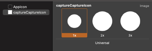
In order to provide a custom image for the manual capture button icon, an image set with the name captureCaptureIcon was created in the main app’s bundle. The image set contains 3 icons: @1 (50x50), @2 (100x100), and @3 (150x150).
 Full size
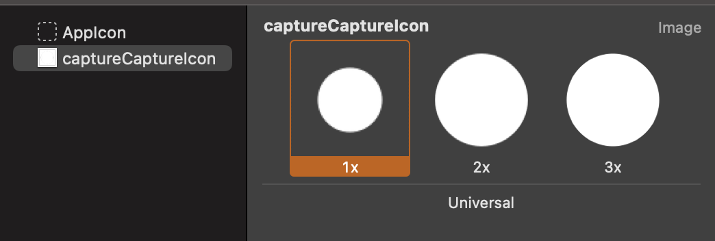
Since the image was added to main bundle, the images bundle will be specified as follows:
const captureConfiguration: SbCaptureConfiguration = {
    captureFeatures: {
      // ...
    },
    branding: {
      iosColors: {
        // ...
      },
      iosFonts: {
        // ...
      },
      iosBundles: {
        images: {
          kind: 'main',
        },
      },
    },
  };
Providing Custom Strings / Localization
The custom strings / localization can be provided as explained on Localization page, and then a bundle where custom strings can be found should be defined as part of SbCaptureConfiguration .
All custom strings are optional, and if not provided, the default SDK strings will be used. Also, if you don’t provide any localization bundle at all (SbCaptureConfiguration.branding.iosBundles.localization in Step 2 in this section), the SDK will use all default strings.
Step 1: Add custom strings and localization to iOS app
Follow the Localization guide.
Step 2: Specify the localization bundle
The localization bundle should be provided as part of iosBundles property of the branding property in the SbCaptureConfiguration .
Each property inside iosBundles can be of one of the following types:
- SbMainBundle which defines main app’s bundle, and doesn’t require additional properties.
- SbCustomBundle which defines a custom bundle. This type of bundle requires the name specified as an additional property.
Example
If custom localization was provided in main app’s bundle, the following should be added to SbCaptureConfiguration :
const captureConfiguration: SbCaptureConfiguration = {
    captureFeatures: {
      // ...
    },
    branding: {
      iosColors: {
        // ...
      },
      iosFonts: {
        // ...
      },
      iosBundles: {
        localization: {
          kind: 'main',
        },
        images: {
          // ...
        },
      },
    },
  };