Branding Colors
SDK uses colors mapped as in the chart below.
| Property | Default Color | Description |
|---|---|---|
| primary | #0079C1 | The primary brand color. |
| primaryVariant | #003d61 | A lighter or a darker variant of the primary color. |
| onPrimary | #FFFFFF | Text and graphics on primary and primaryVariant colors. |
| secondary | #B3C2CC | The secondary brand color. |
| onSecondary | #141414 | Text and graphics on secondary color. |
| background | #D9E1E6 | A neutral color used for background of the views. |
| onBackground | #141414 | Non-actionable text and graphics shown on background |
| surface | #FFFFFF | Defines the color of surfaces of components, such as cards, sheets, and menus. |
| surfaceVariant | #E8F5FC | An accent background on top of surface. |
| onSurface | #4D4D4D | Non-actionable text and graphics on top of surface or surfaceVariant colors. |
| onSurfaceFocus | #1C91D6 | Actionable items and important graphics to help focus user's attention on. May be displayed on background, surface, or surfaceVariant. |
| error | #C30000 | The background color or the error messages. |
| onError | #FFFFFF | The color or the error messages. May be displayed on background, surface, or surfaceVariant. |
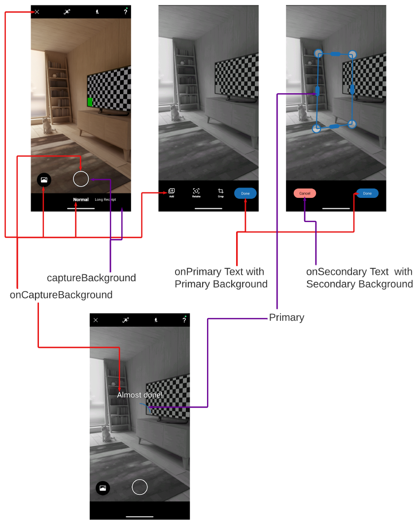
| captureBackground | black | The color of background on Capture's screens related to taking and editing the image. |
| onCaptureBackground | white | The color of text and icons on Capture's screens related to taking and editing the image. |
These colors constants (with values specified by an integrator, or default values) are passed to Sensibill UI, which ensures that Sensibill API’s look and feel is the same as the rest of the application.
Capture uses these colors as well as shown on the following diagram:
 Full size